
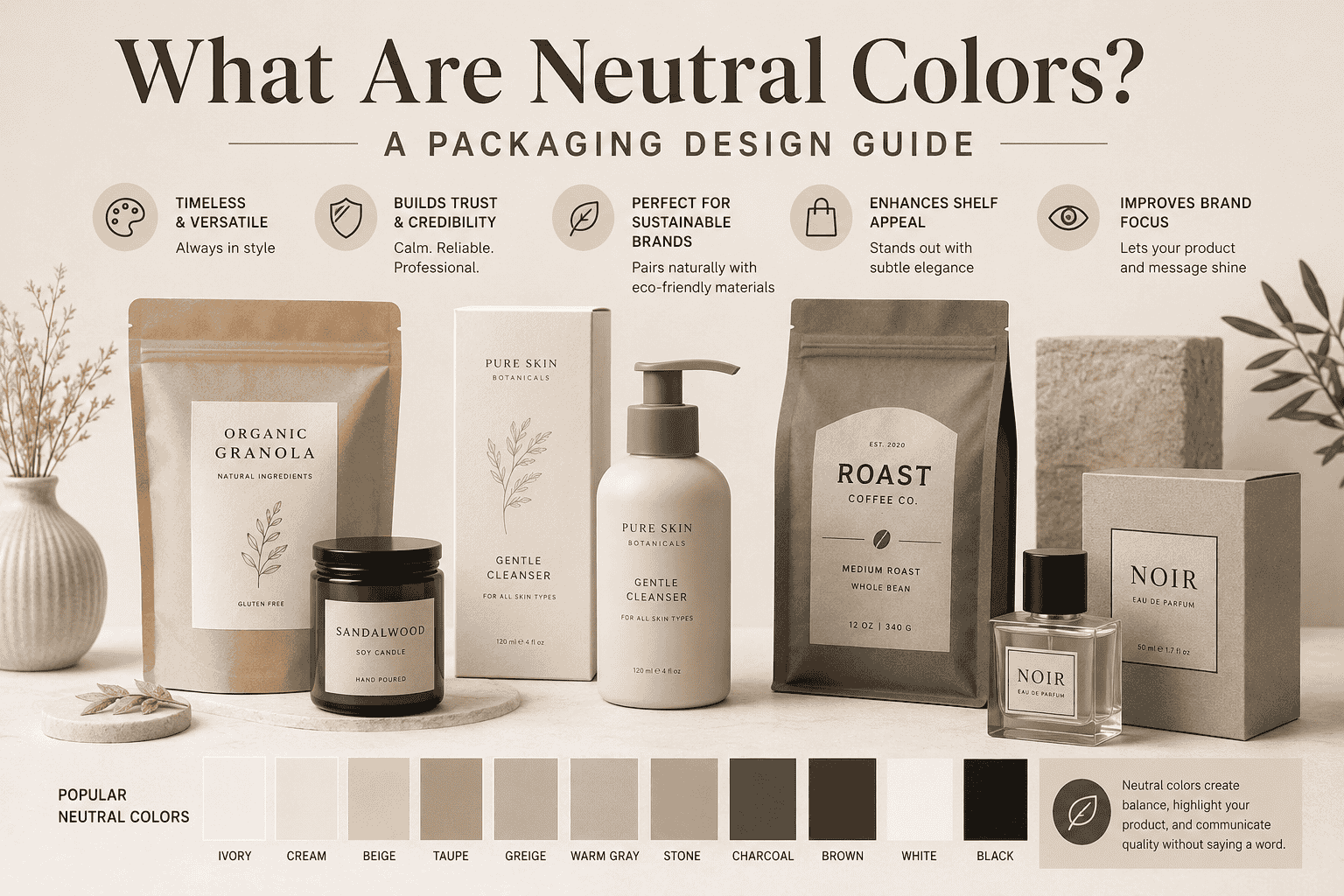
If you have ever picked up a product because the box just looked right, neutral colors probably had something to do with it. So, what are neutral colors, and why do so many brands lean on them? In simple terms, neutral colors are shades that sit outside the traditional color wheel. Think beige, cream, gray, taupe, and soft white. They don’t shout for attention, yet they somehow hold a shelf full of louder packages together. For anyone working in Product Packaging Design, understanding this color family is one of the fastest ways to build a look that feels calm, confident, and easy to trust.
This guide walks through the meaning of neutral colors, where each shade fits, and how packaging teams put them to work.
What Are Neutral Colors, Exactly?
Neutral colors are tones drawn from nature rather than the rainbow. Brown, gray, beige, cream, ivory, and taupe all fall into this group. Black and white are usually included too, since they can pair with almost anything without a fight.
What separates neutral colors from the rest of the spectrum is restraint. A bright red or a deep teal makes a statement on its own. Neutral tones step back and let the product, the typography, or the material speak first. That’s part of the meaning of neutral colors that designers talk about most: quiet confidence instead of loud competition.
Packaging teams reach for neutrals when they want a design that ages well. Trends come and go, but a taupe box or a cream-colored pouch rarely looks dated five years later. That kind of staying power matters for brands that print in bulk and can’t afford to reprint every season, which is exactly why packaging color decisions get so much attention early in a project.
The Meaning Behind Neutral Colors in Design
Color psychology gives neutrals a specific job. Gray reads as steady and reliable. Beige feels warm and approachable. Cream and ivory suggest softness, often used for skincare or baby products. Taupe blends gray and brown, giving it a grounded, earthy feel.
None of these shades ask the customer to feel excited the way orange or hot pink might. Instead, they build trust. A shopper glancing at a Retail Packaging shelf tends to associate neutral tones with quality ingredients and honest branding, even before reading a single word on the label.
This is why so many premium and minimalist brands lean on soft, muted tones from day one. It’s not a lack of creativity. It’s a deliberate choice to let the product itself carry the message.
A List of Neutral Colors Every Packaging Team Should Know
Here’s a practical list of neutral colors that show up again and again in packaging work: beige, cream, ivory, taupe, gray, warm white, greige (a mix of gray and beige), sand, stone, and charcoal. Each one carries a slightly different mood, so picking the right one depends on the product and the audience.
Beige works well for food and wellness packaging because it feels natural and unprocessed. Cream and ivory suit beauty and personal care lines that want a soft, gentle tone. Gray and charcoal show up more in tech, grooming, and men’s grooming lines, where a cooler, more structured feel fits the brand.
Sand and stone sit somewhere in between. They carry warmth without leaning too far into brown, which makes them a safe middle ground for brands still testing what resonates with their audience.
Greige deserves a special mention here, since it’s become one of the most requested shades in packaging over the past few years. It splits the difference between gray and beige almost perfectly, giving designers a tone that feels modern without leaning cold. Charcoal, on the other hand, works best as an accent rather than a base color, since large amounts of it can make a package feel heavier than intended.
Warm vs Cool: Building a Neutral Palette
Not all neutrals behave the same way. Warm neutral colors, like beige, cream, and sand, carry a hint of yellow or red underneath. They feel cozy and inviting, which is why bakeries, coffee brands, and home goods companies use them so often.
Cool neutral colors, like gray, taupe, and charcoal, carry a touch of blue or green underneath. They feel more structured and modern, which explains why tech accessories and grooming products often go this route.
A quick way to tell the two apart is to hold a swatch next to pure white paper. If the shade looks slightly yellow or pink compared to others, it’s warm. If it looks slightly blue or green, it’s cool. This trick sounds simple, but it saves a lot of back-and-forth during proofing, especially when a client is choosing between two shades that look nearly identical on a screen but print very differently.
Building a strong neutral color scheme usually means picking one dominant tone, warm or cool, and letting the rest of the design support it. Mixing warm and cool neutrals without a plan can make a package look muddy instead of intentional. A good rule of thumb: pair no more than two or three neutral shades on one design, then add a single accent color if the brand needs a pop of personality.
Tonal Neutral Colors and How They Work Together
A tonal neutral color approach means staying within one family of shades but varying the intensity. Picture a coffee bag that uses light beige for the background, a medium taupe for the logo, and a deep brown for the text. Nothing clashes because everything comes from the same warm family, just at different depths.
This layering technique gives depth to a design without introducing bold colors that might fight with the product itself. It’s a favorite trick among designers working on eco-conscious projects, since earthy, tonal neutrals naturally pair with kraft paper, recycled board, and other renewable materials.
Tonal neutrals also photograph well. Since the shades sit close together on the color spectrum, product photos taken for e-commerce or social media tend to look clean and consistent, which matters more than ever now that most shoppers browse a screen before they see a package in person.
Why Packaging Color Choices Matter for Your Brand
Packaging color is often the first thing a customer notices, before the logo, before the copy, and long before the ingredients list. A well-chosen palette can signal whether a brand is playful, premium, organic, or high-tech, all without a single word being read.
Neutral colors carry a specific advantage here: versatility. A box in taupe or warm gray works just as well on a boutique shelf as it does in a big-box retail aisle. That flexibility makes neutral tones a smart choice for brands selling across multiple channels, from Flexible Packaging pouches to rigid boxes to shipping mailers.
There’s also a practical side to this. Neutral inks tend to print more consistently across different substrates and printing methods, which helps keep colors accurate from the first production run to the tenth. For companies managing Custom Packaging Solutions across several product lines, that consistency saves time and reduces costly reprints.
How Neutral Colors Shape Consumer Perception
Color harmony plays a bigger role in consumer perception than most shoppers realize. A package built around clashing colors can feel chaotic, even if the product inside is excellent. A package built around a calm, coordinated set of earth tones tends to feel more thought-through, even before the customer reads a single ingredient.
This matters most on a crowded shelf. Shelf appeal isn’t just about standing out. Sometimes it’s about standing apart more calmly, letting a muted, neutral box catch the eye precisely because it doesn’t scream for attention the way a neon label does. Retailers often notice this too, since a shelf full of neutral tones next to one bold accent color draws the customer’s focus exactly where the brand wants it.
Minimalist design leans heavily on this idea. Fewer colors, fewer competing elements, and more white space give a package room to breathe. Neutral tones naturally support that approach, since they rarely clash with logos, typography, or product photography. The result is a stronger sense of brand identity, built less on flashy graphics and more on consistency across every touchpoint, from the box on the shelf to the bag on a delivery truck.
Visual appeal, in this context, isn’t about being the loudest package in the aisle. It’s about looking put-together, and neutral tones make that far easier to achieve than most designers expect.
Neutral Color Palette Examples in Packaging
Seeing how neutral tones actually play out across different categories makes the whole idea easier to apply. A few examples make the packaging color choices clearer.
Cosmetics brands often reach for ivory, soft beige, and warm gray to suggest purity and a gentle formula. A moisturizer jar in cream with a taupe label reads as calm and skin-friendly before the customer even opens the lid.
Coffee packaging leans on warm neutrals almost by default. Kraft brown, sand, and deep charcoal show up constantly on bags because they echo the roast itself, giving the package an honest, unprocessed feel that matches what’s inside.
Organic food packaging follows a similar logic. Beige and stone tones, often paired with a small pop of green, tell the shopper this product skipped the artificial dyes and heavy processing, even before they flip the pack over to check the label.
Luxury packaging tends to favor cooler, more restrained neutrals like soft gray, ivory, and taupe, often finished with foil stamping or embossing. The neutral base keeps attention on the texture and finish rather than competing with a busy color scheme, which is exactly what a premium unboxing experience needs.
Neutral Colors in Custom and Eco-Friendly Packaging
Neutral tones and eco-friendly materials go hand in hand. Kraft paper, recycled board, and unbleached pouches already carry a warm, earthy base color, so designers working with these materials often build the rest of the palette around soft beige, brown, or stone tones rather than fighting the material with bright inks. This pairing is a big reason Sustainable Packaging projects lean so heavily on neutral, natural-looking colors instead of bright synthetic ones.
This pairing works across categories. A snack brand using Food Packaging made from recycled film can lean into warm neutrals to reinforce a natural, minimally processed image. A supplement company using Pharmaceutical Packaging can use cool grays and whites to suggest clinical precision and cleanliness.
Neutral palettes also give smaller brands room to grow. Since the base colors rarely go out of style, a company can add new products or seasonal packaging without redesigning the entire line. That kind of long-term thinking is something the team at Contipack Inc talks about often with clients who want packaging that holds up for years, not just one product cycle.
FAQs
Q1: What are neutral colors?
Neutral colors are shades like beige, cream, gray, taupe, and white that don’t appear on the traditional color wheel. They pair easily with other colors and tend to feel calm rather than bold.
Q2: What is a neutral palette?
A neutral palette is a color scheme built mainly from neutral shades, often with one or two accent colors added for contrast. It’s common in minimalist design and premium branding.
Q3: Which colors are considered neutral?
Beige, cream, ivory, gray, taupe, white, black, and brown are the most common neutral colors. Greige, sand, and stone are popular variations used in packaging and interior design.
Q4: What is the meaning of neutral colors?
Neutral colors generally represent balance, calm, and reliability. They let other design elements, like a logo or product image, stand out without competing for attention.
Q5: Why are neutral colors used in packaging?
Neutral colors give packaging a look that lasts well beyond one season, print consistently across materials, and pair well with natural or recycled substrates. They also help products look premium without heavy design work.
Q6: How do neutral colors affect branding?
Neutral colors can make a brand feel more trustworthy and mature. Warm neutrals suggest warmth and approachability, while cool neutrals suggest precision and structure.
Q7: Are neutral colors good for luxury packaging?
Yes. Many luxury brands use neutral tones like taupe, ivory, and soft gray because these shades feel refined without relying on flashy colors or heavy graphics. Pairing a neutral base with subtle foil stamping or embossing often does more for a premium feel than adding extra color ever could.
Q8: What are the best neutral colors for packaging design?
Beige, cream, taupe, and warm gray tend to perform best across food, beauty, and lifestyle packaging, since they feel natural and adapt to different materials and finishes.
Common Mistakes When Using Neutral Colors in Packaging
A few missteps show up again and again once teams start working with neutral tones, and most are easy to avoid once you know to watch for them.
Using too many neutral shades on one package is the most common one. Three or four similar tones on a single box can look muddy instead of intentional, since there’s nothing left to anchor the eye. Sticking to one dominant shade with a couple of supporting tones almost always reads cleaner.
Low contrast typography is another frequent problem. Light gray text on a cream background might look elegant on a screen, but it can become nearly unreadable once printed, especially under store lighting. Testing a proof under real conditions catches this before it becomes a costly reprint.
Ignoring the print substrate color is an easy trap too. Kraft paper, uncoated stock, and recycled board all carry their own base tone, and a neutral ink that looks right on white paper can shift noticeably once it hits a warmer or grayer material. Proofing on the actual substrate, not just a digital mockup, avoids this.
Mixing warm and cool neutrals without a plan rounds out the list. A beige box paired with a cool gray label can look like two different brands got combined by accident. Picking one temperature and staying consistent keeps the whole package feeling coordinated.
Final Thoughts
So, what are neutral colors when you boil it all down? They’re the quiet workhorses of packaging design, doing more for a brand’s shelf presence than most shoppers ever consciously notice. Beige, cream, gray, taupe, and their many variations don’t demand attention, but they build the kind of trust that keeps customers coming back. Whether a brand is launching its first product or refreshing a line that’s been around for years, a well-planned set of neutral tones offers a flexible, cost-effective way to look polished on any shelf, in any market, for years to come.